A Pareto chart is a special type of bar chart where the values being plotted are arranged in descending order. It is named for Vilfredo Pareto, and its use in quality assurance was popularized by Joseph M. Juran and Kaoru Ishikawa.
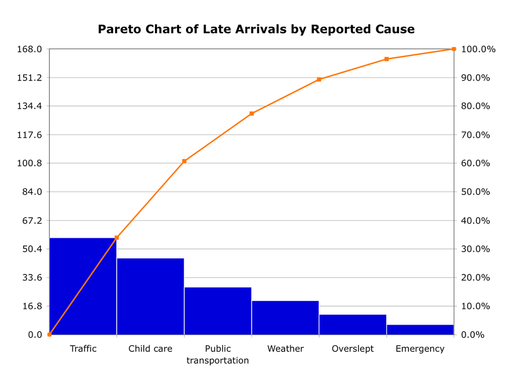
Simple example of a Pareto chart using hypothetical data showing the relative frequency of reasons for arriving late at work.
Enlarge
Simple example of a Pareto chart using hypothetical data showing the relative frequency of reasons for arriving late at work.
The Pareto chart is one of the seven basic tools of quality control, which include the histogram, Pareto chart, check sheet, control chart, cause-and-effect diagram, flowchart, and scatter diagram. See Quality Management Glossary.
Typically the left vertical axis is frequency of occurrence, but it can alternatively represent cost or other important unit of measure. The right vertical axis is the cumulative percentage of the total number of occurrences, total cost, or total of the particular unit of measure. The purpose is to highlight the most important among a (typically large) set of factors. In quality control, the Pareto chart often represents the most common sources of defects, the highest occurring type of defect, or the most frequent reasons for customer complaints, etc.
(Reference WiKipedia)
No comments:
Post a Comment